PLANTATION INTERIORS
  • Home
  • Contact
  • Projects
  • Team
  • Farrow & Ball
  • Gallery
  • LaSOURCE

PREFERENCE RED

No. 297
Farrow & Ball - Paint Colours - Preference Red
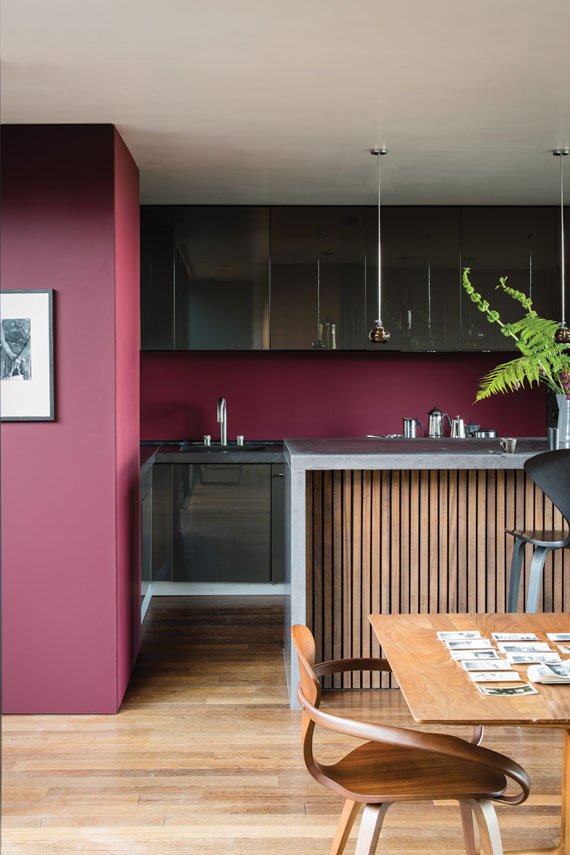
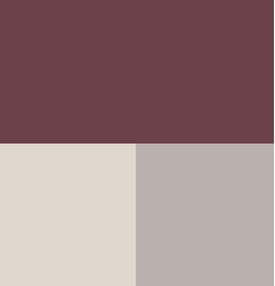
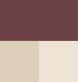
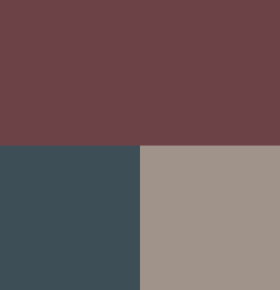
Picture

A deep, rich red

The deepest and richest of our reds, this Baroque colour is named in honor of our original trade name, Preference Paints. It can be used with any of the Red Base Neutrals but is particularly striking when seen in combination with Paean Black and Sulking Room Pink. The preferred red of modern homes!

Recommended Primer & Undercoat: Red & Warm Tones

Complementary white: Bone

COLOUR SCHEMES


Picture
Skimming Stone
​Dove Tale

Picture
Hague Blue
Charleston Gray

Picture
Joa's White
​Dimity

Picture
 
Picture
Skimming
​Stone
Dove
​Tale
Picture
Joa's
​White
Dimity
Picture
Hague
​Blue
Charleston
​Gray
Picture


843-785-5261

10 Target Rd.
​Hilton Head Island SC 29928

RETAIL SHOWROOM

FABRIC GALLERY

DESIGN STUDIO

Vertical Divider
CONTACT
ABOUT
COVID-19
OUR BRANDS
CAREERS
Vertical Divider
VENDOR RESOURCES
DONATIONS
SUSTAINABILITY MISSION
AWARDS
PRESS
Vertical Divider
Picture
Picture
Picture
Copyright © 2025 PI Home
  • Home
  • Contact
  • Projects
  • Team
  • Farrow & Ball
  • Gallery
  • LaSOURCE